APP STRATEGY
Objective
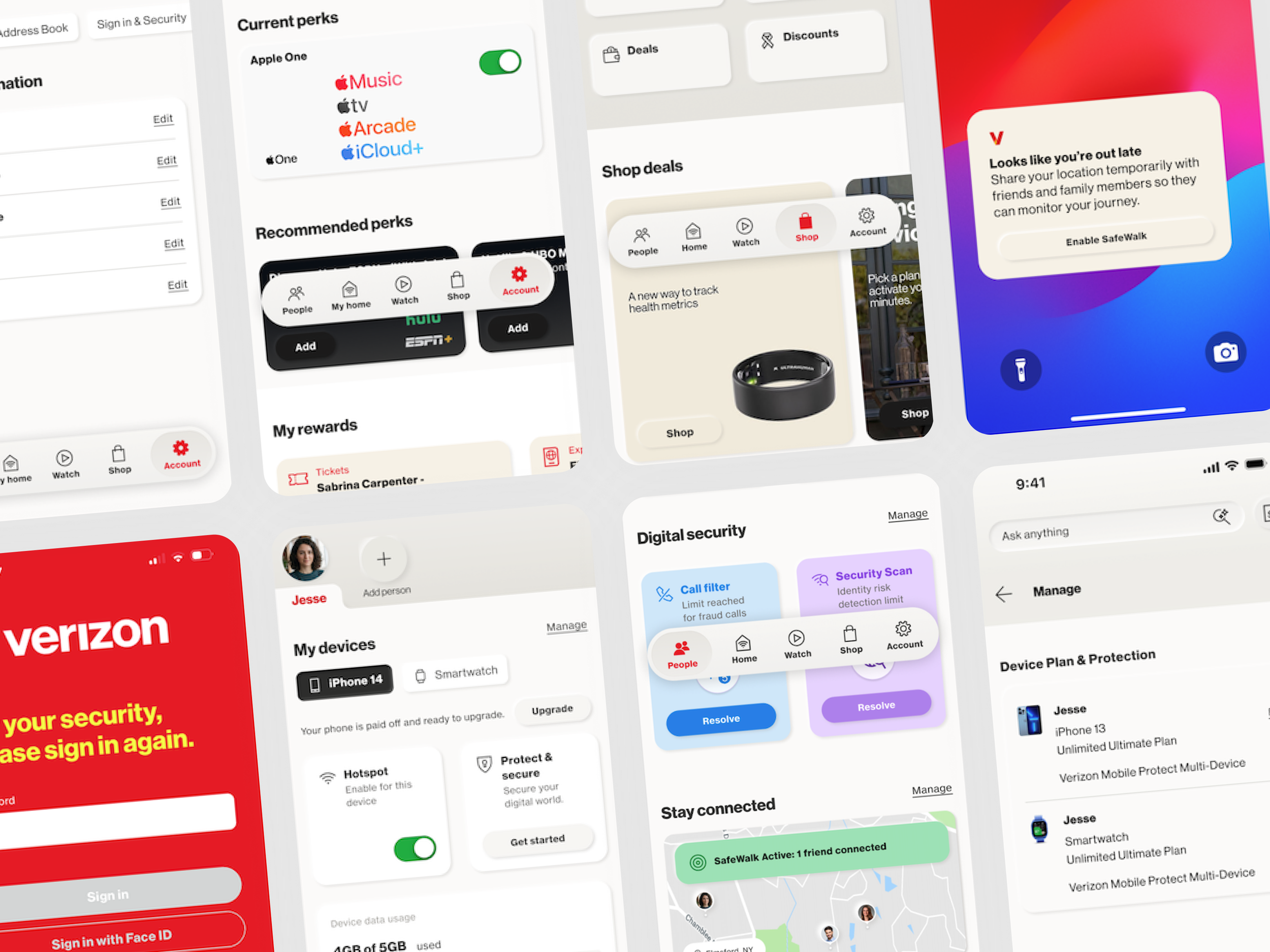
Transform Verizon’s digital experience from a basic billing utility into a proactive Connected Life Companion. To ensure viability, we stress-tested a unified app concept combining Mobile, Home, Protect, and Family services—building a validated, ready-to-deploy digital asset to support Verizon’s broader shift toward a lifestyle brand.
My Role & Impact
Vision to Execution: Translated long-term strategic goals into tangible design components and interactive prototypes, establishing the core architecture through low-to-high fidelity wireframes and exploring multiple design iterations to identify optimal solutions.
Intent-Based Architecture: Streamlined multifaceted ecosystem features into simplified, task-focused user flows.
Adaptive Personalization: Designed dynamic interface states that tailor feature hierarchy to distinct customer life stages (from single users to full families).
THE PROCESS
Discovery & Business Requirements
Low Engagement: Currently, the app is viewed as a utility with low monthly engagement (focused heavily on paying the bill). The business requires a solution that creates high-frequency, habit-forming daily engagement.
Ecosystem Complexity: Customers suffer from cognitive overload due to managing 14 different consumer apps and fragmented logins. The business requires a unified architecture.
Solve the "Stickerbook": Move away from chaotic, aggressive cross-selling scattered across the app (the Pathfinder problem) toward a structured, intent-based discovery model.
Initial Insights & Mental Models
Validation of Unification: Research confirmed high user demand for a unified digital ecosystem, eliminating app fatigue and fragmenting workflows.
Intent vs. Dashboard Architecture: Evaluated two core models:
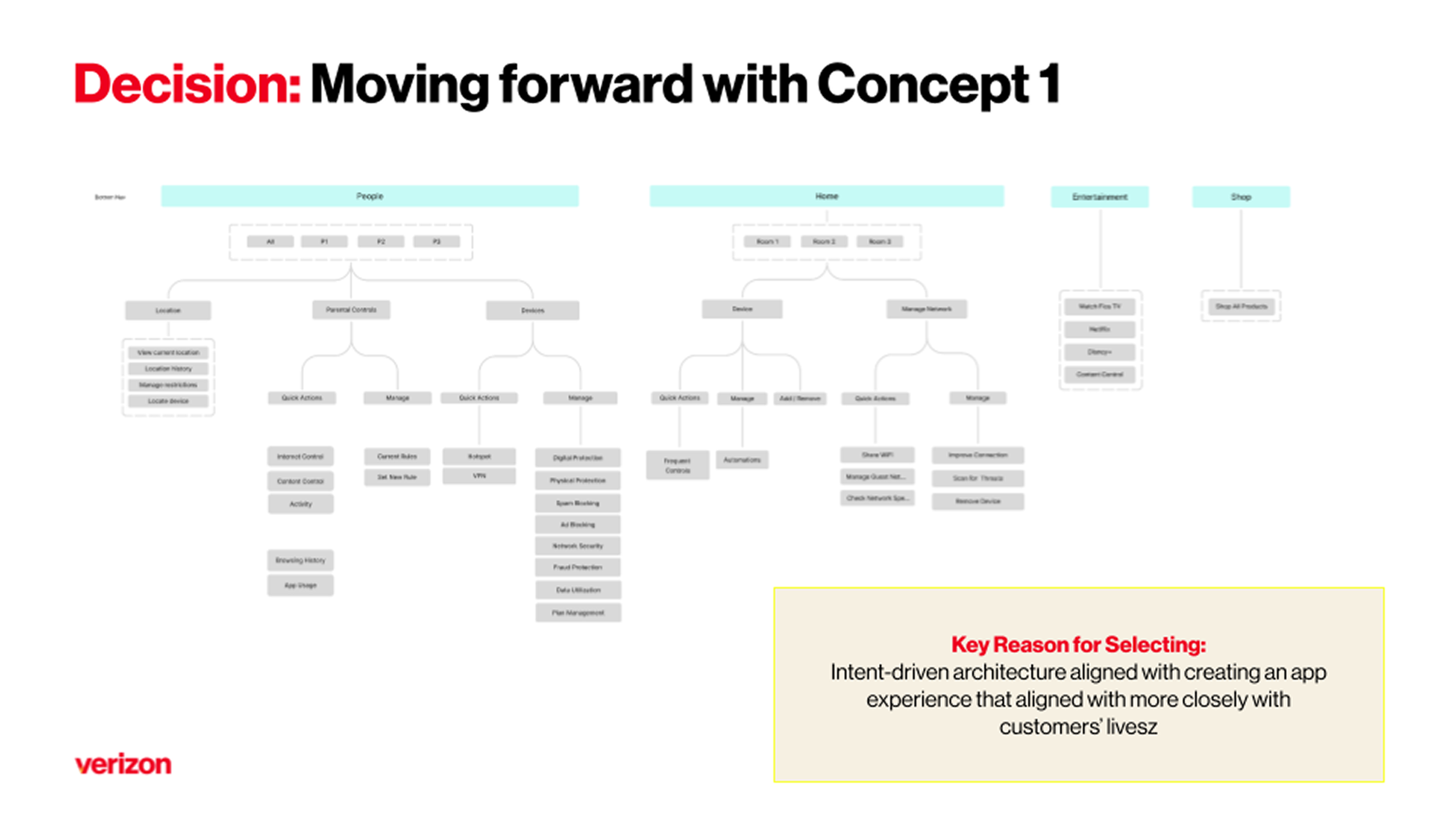
Concept 1 (Intent-Based): Organized around high-frequency customer goals. Users easily navigated quick actions, making it the superior architectural baseline.
Concept 2 (Dashboard/Hub): Highlighted high-level account status updates. While users valued customizable status widgets, the complex navigation between "People" and "Home" created friction.
Mental Model Misalignments:
Security vs. Connection: Grouping live location tracking alongside network security (VPNs) in "People" caused confusion.
The "My Home" Split: Users struggled with a dual-purpose tab—expecting either hardware/IoT control or network management, but not both at once.
Design Decisions & System Architecture
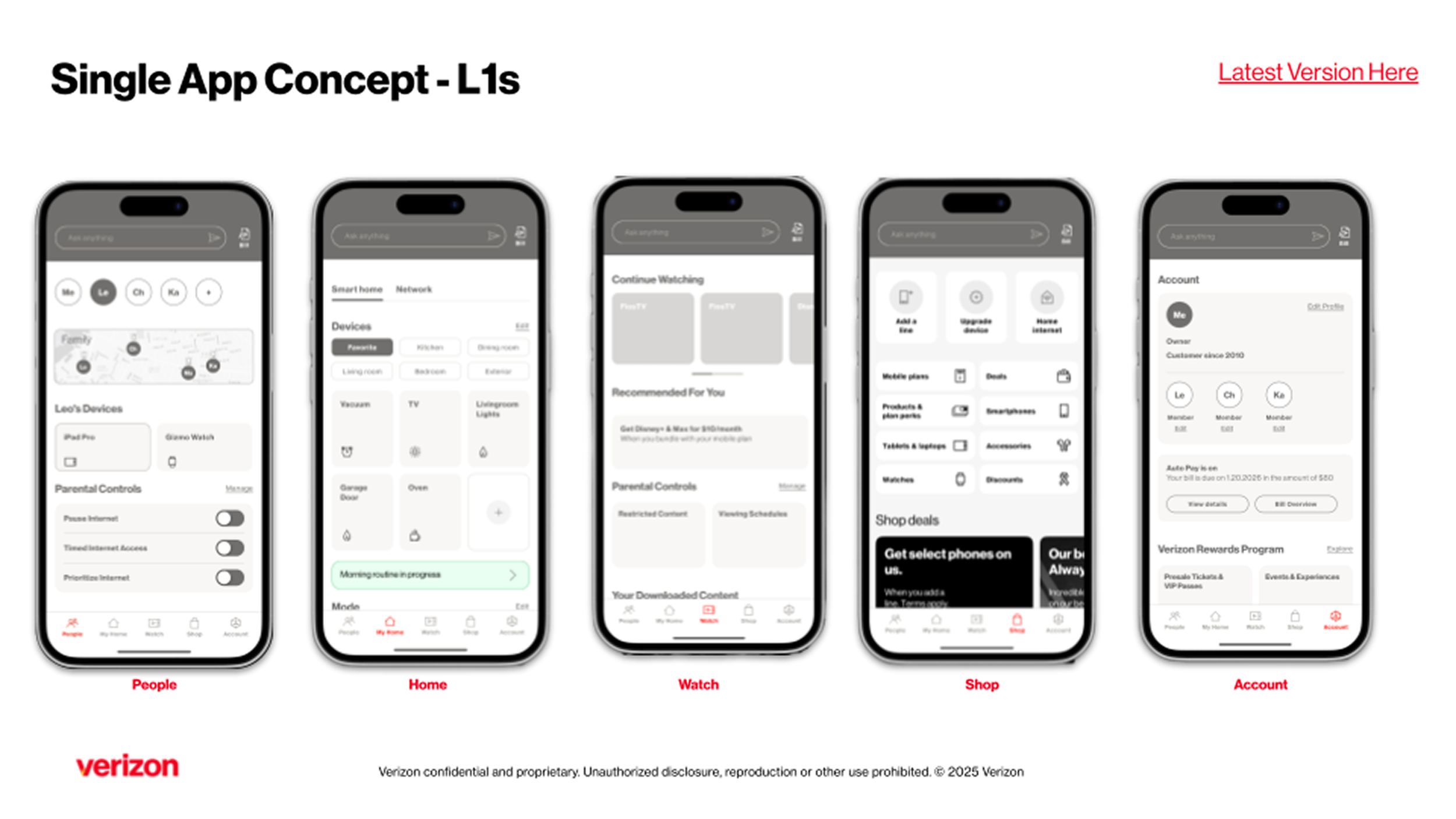
5-Item Core Navigation (L1): Streamlined bloated navigation into five distinct pillars: People, My Home, Watch, Shop, and Account.
UI Refresh & Tactility: Shifted away from heavy brand colors to a neutral "stone" palette paired with modern neomorphic layering to increase visual clarity and hierarchy.
Tile-to-Widget Design System: Engineered a flexible UI pattern where bite-sized status tiles expand into rich, interactive widgets, lowering cognitive overload for complex actions.
Contextual Loyalty Integration: Removed "Loyalty" from primary navigation, embedding rewards contextually within workflow surfaces (e.g., surface a reward when managing a family line).
Research Synthesis & Iteration
Architectural Stress Testing: Conducted two research rounds evaluating Concept 1 vs. Concept 2. Single-line users felt overwhelmed by family-centric views, prompting dynamic UI adjustments based on account tiers.
User Feedback Summary:
"More modern, streamlined, and cohesive with flat navigation that removes guesswork."
Core Takeaways: While users praised Concept 2’s customized dashboards, Concept 1’s intent-based structure proved far superior for usability, leading to a hybrid model that adopted intent navigation with widget-style customization.
Aligning multi-department business goals required navigating key trade-offs:
Loyalty vs. Screen Real Estate: Product advocated for a top-level Loyalty tab to meet engagement targets. Using research data showing user resistance to transactional tabs in a companion app, I pitched an inline, contextual reward strategy that protected navigation usability while driving higher conversion.
IoT Control vs. Network Management: Business teams wanted a single "Home" hub, but testing showed users separate network setup from smart home control. I led the architectural compromise to unify status views via extensible widgets rather than competing sub-menus.
Business Value & Deliverables
Executive Prototype ("Art of the Possible"): Built high-fidelity, interactive prototypes mapping end-to-end life scenarios (e.g., managing IoT smart climates, tracking family members, and filing device claims).
De-Risked Strategic Asset: Delivered a fully validated, production-ready blueprint that aligned cross-functional leadership, eliminating speculative debates and providing a "shelf-ready" asset.
Projected Impact: Validated UX performance to support key metrics, aiming to expand beyond the baseline 79.4M monthly visits and 56.5% engagement rate.